Today the final Windows Phone Developer Tools have been released! You can read all the details over at the Window Phone Developer Blog post.
Other Relevant Links for the Windows Phone Developer Tools:
But wait, there’s more!
Today the Silverlight for Windows Phone Toolkit was released too! You can go download it now from here. The toolkit includes additional controls beyond the core Windows Phone controls that you can download and reference in your Windows Phone applications. These additional controls include: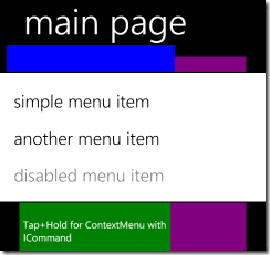
- ToggleSwitch
- WrapPanel
- ContextMenu
- DatePicker
- TimePicker
- GestureService
The Silverlight for Windows Phone Toolkit is similar to the Silverlight Toolkit in that they both provide a means to for Microsoft to deliver new controls that offer a consistent experience out of band.
We cover the toolkit controls and much more in our book Learning Windows Phone Programming (O’Reilly publishing). We are targeting to have to rough cuts out by PDC and the book in print later this year.
Getting Started with the Toolkit
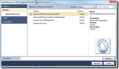
Once you download the bits and add a reference to the assemblies, you are ready to go. The key assembly containing the Toolkit controls Microsoft.Phone.Controls.Toolkit.dll.
ToggleSwitch
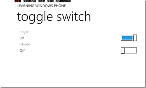
The ToggleSwitch is ideal for handling binary states which are common in settings pages. It has a header, a value, and uses a small slider as a visual indicator. The ToggleSwitch is designed to match the native experience. The image below shows a sample application showing the ToggleSwitch in action. Notice the header for the first ToggleSwitch is ringer and the value is On. The slider is slid to the right and is highlighted in the blue accent color from the phone’s theme.
<toolkit:ToggleSwitch Header="ringer" IsChecked="True" />

<toolkit:ToggleSwitch Header="vibrate" IsChecked="False" />
WrapPanel
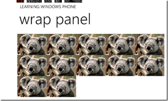
The WrapPanel allows you to arrange child controls vertically or horizontally. The child controls will wrap (similar to how text wrapping works) inside of the WrapPanel. This makes the WrapPanel ideal for situations where you want your child controls to flow and wrap.
When a collection of items are placed inside of a WrapPanel using a horizontal orientation, the items will appear one after each other to the right, but when the visual boundary of the right hand side is reached the items will begin filling in below the previous row.
<toolkit:WrapPanel Name="wrapPanel1"

Orientation="Horizontal"

ItemHeight="90" ItemWidth="130" >

<Image Stretch="Fill"

Source="/LWP.WrapPanel;component/Koala.jpg" />

<Image Stretch="Fill"

Source="/LWP.WrapPanel;component/Koala.jpg" />

<Image Stretch="Fill"

Source="/LWP.WrapPanel;component/Koala.jpg" />

<Image Stretch="Fill"

Source="/LWP.WrapPanel;component/Koala.jpg" />

<Image Stretch="Fill"

Source="/LWP.WrapPanel;component/Koala.jpg" />

<Image Stretch="Fill"

Source="/LWP.WrapPanel;component/Koala.jpg" />

<Image Stretch="Fill"

Source="/LWP.WrapPanel;component/Koala.jpg" />

<Image Stretch="Fill"

Source="/LWP.WrapPanel;component/Koala.jpg" />

<Image Stretch="Fill"

Source="/LWP.WrapPanel;component/Koala.jpg" />

<Image Stretch="Fill"

Source="/LWP.WrapPanel;component/Koala.jpg" />

<Image Stretch="Fill"

Source="/LWP.WrapPanel;component/Koala.jpg" />

<Image Stretch="Fill"

Source="/LWP.WrapPanel;component/Koala.jpg" />

<Image Stretch="Fill"

Source="/LWP.WrapPanel;component/Koala.jpg" />

<Image Stretch="Fill"

Source="/LWP.WrapPanel;component/Koala.jpg" />

</toolkit:WrapPanel>
ContextMenu
The ContextMenu provides a context-sensitive menu, and looks and behaves just like the one that is used across the native phone applications.
<Grid Background="Blue">
    <toolkit:ContextMenuService.ContextMenu>
        <toolkit:ContextMenu>
            <toolkit:MenuItem
                Header="first menu item"
                Click="MenuItem_Click"/>
            <toolkit:MenuItem
                Header="second menu item"
                Click="MenuItem_Click"/>
            <toolkit:MenuItem
                Header="disabled menu item"
                IsEnabled="False"/>
        </toolkit:ContextMenu>
    </toolkit:ContextMenuService.ContextMenu>
</Grid>
DatePicker & TimePicker
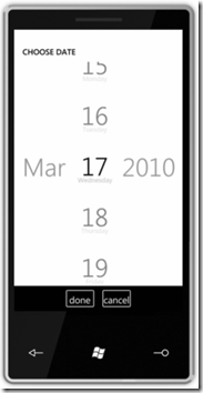
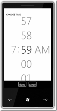
The DatePicker and TimePicker controls are pretty self explanatory as they allow you to prompt the user to select a data or time.
GestureService
The GestureService provides an event-driven model for handling gestures in an application. The GestureService can be used by attaching a GestureListener to an element. At that point the element can listen for the gestures that it supports, such as Tap, Hold, Pinch, Flick and others. The basic syntax to add a GestureServiceListener is shown below:
<Image Source="something.jpg">
    <toolkit:GestureService.GestureListener>
        <toolkit:GestureListener Tap="image_Tap" Hold="image_Hold" />
    </toolkit:GestureService.GestureListener>
</Image>
Summary
Downloads:
· Windows Phone 7 Developer Tools
· Silverlight for Windows Phone 7 Toolkit
Other good links:
- Scott Gu’s post
- John Papa’s Blog Post about the Toolkit
- Tim Heuer’s Blog Post about the Toolkit
- Pete Brown’s post on the Windows Phone Dev Tools
- David Anson’s post about the Toolkit
- Jeff Wilcox
- David Anson
- Jesse Liberty’s post
Enjoy!
