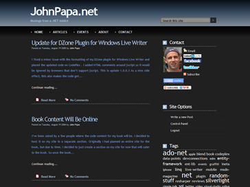
I mentioned the other day that I grabbed the free Embouteillage theme from the Atlanta .NET Guys web site, modified it, and ….. that’s what you are currently looking at.I made a bunch of changes to the layouts, styles, colors, and images. If you want this theme, I packaged it up and you can download the Papa Embouteillage theme from my site here.
Here is a short list of what I changed or did not change that is important:
- I modified all of the red/pink colors to be various shades of blue hues.
- I widened the comment box to make it easier to type.
- I left old style colors in the css page commented out, just in case anyone is curious.
- I hid the 3rd column (called ads) in the layout.view.
- I widened the content column and the sidebar column in the layout.view (since the ads column is hidden).
- Widgets must be placed in the LEFT column, which is really the right column of the theme. (Yes this is weird and I certainly could fix it, but I kind of like how it backwards. It gives it character!)
- I shrunk the header considerably to make more room for content.
- I removed the images from the header.
- I left the comments in there from the authors of the original theme, who allow it to be used freely.
That’s about it really. Grab it, change it, do what you will!


