I have many colleagues who have touted the merits of dark backgrounds in Visual Studio and I have tried several variations, yet I always end up back on white. It is not so much that the background needs to be white, rather it is more that I have never found a good mixture of foreground colors that work well on a dark background. Well, I spent some time this evening trying some new settings out. I was determined to find something better for me ... something that would not bother my eyes nearly as much as the bright white backgrounds. Here is what I came up with:
It is a mixture of mostly blue, red, green and purple hues that seem to work pretty well for my eyes so far. It is not a true black background either. I found that if I stick to a charcoal background the colors are a bit less striking (to me of course). I like the faded look in general and imagine I will be tinkering with this for a while.
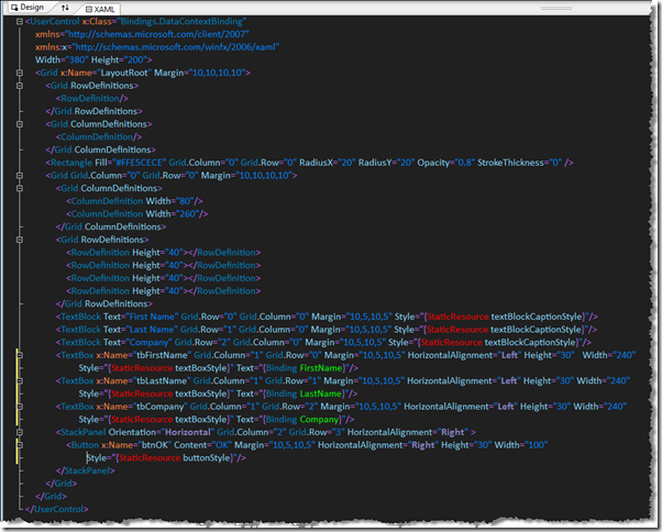
Here is how some XAML looks using my new scheme:
The red items are error highlighting from the Resharper styles. I had to tinker quite a bit to get all of the styles to work well, especially since Resharper 4 has its own styles that it injects. Will I keep this theme? Who knows. If you want to try it, I have attached the Dark Side with Blue Hues settings file here. However be warned that you should first backup your settings file before trying any new ones. (This means "try new settings at your own risk")
I'll be turning it back to normal if I take any screen shots for my chapters or articles, though. No need to force my craziness on the editors :)


